A Little Japanese, Every Time You Walk Past
My wife quite liked TRMNL's Japanese vocabulary plugin, but wanted a few things changed. Building Kotoba for her has been one of my favourite uses of AI.
6 min read
My wife was quite liking the Japanese vocabulary plugin on our TRMNL. Having a word sitting there to look at as she went about her day was useful, but there were a few things she wanted changed. The pronunciation, the choice of words, how they were presented, how often they changed. Fairly specific requests from someone actually trying to learn Japanese, which is a much better starting point for a project than me deciding what someone else ought to find useful.
The result is Kotoba, a Japanese vocabulary flashcard plugin for TRMNL. It’s become one of those little home projects that makes me unusually happy, because the person I built it for uses it and loves it.
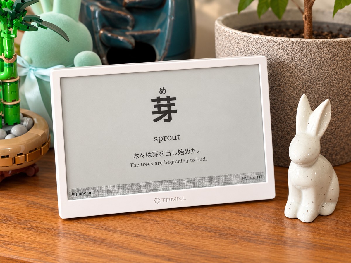
Kotoba in use at home, with the pronunciation above the kanji and the learning levels along the bottom.
I should probably declare my enthusiasm for the hardware before going any further. I love the TRMNL and TRMNL X devices. We now have three of the smaller originals and three of the X devices around the house, doing various jobs. Six might sound excessive, but apparently my response to finding a useful e-ink display is to find five more uses for it :D
What I like about them is having information available without having to go and fetch it. You can glance at a display, take in whatever is useful, and carry on. There’s no need to unlock a phone and risk discovering three unrelated things that suddenly seem more urgent. Japanese vocabulary fits that sort of interaction rather nicely: a small opportunity to practise, already sitting in the room.
The stock Language Learning plugin had already demonstrated that this was useful. It gives you a word and an example sentence, with a new word every 24 hours. That was a good starting point. I wanted to keep the simplicity while making the Japanese cards work better for my wife.
The most obvious change is furigana: the small phonetic characters above the kanji that tell you how to read them. Putting the reading directly above the relevant characters makes the relationship much easier to follow. Your eyes can stay with the word, with its pronunciation right there where you need it.
There is a little more to getting that right than putting a second line of text above the first. In 取り除く, for example, と belongs above 取 and のぞ belongs above 除. The り and く stay as they are, without extra annotations. Some readings belong to a group of kanji and need to stay together; words written entirely in kana don’t need furigana at all. Kotoba uses precomputed reading segments to preserve those relationships. It’s a small visual detail that was central to the whole reason for building it. The design notes go into the fiddly bits.
There’s plenty of vocabulary to grow into: 8,289 words across N5 to N1, the five Japanese Language Proficiency Test levels, with example sentences for roughly 88% of them. There is a concise English meaning alongside the word, and the Japanese example gives you a chance to see it used in context. An English translation of the example is optional in the full layout, so you can decide how much help you want on screen. The original already had sentences; here I wanted a broad pool of material with control over what you encounter.
You choose a learning level, and it includes the easier levels as well. Set it to N3 and you’ll see N5, N4 and N3 vocabulary, so moving up doesn’t mean abandoning the words you’ve previously learnt. The bottom of the card shows that range and underlines the level of the current word. I like that you can tell where something sits without having to look it up. Those level assignments are community estimates, as the repository explains, so they’re useful guidance rather than an official exam checklist.
I also cared about the fonts and the space around them. The Japanese text uses a sans-serif font stack that prefers Noto Sans CJK JP and Noto Sans JP, with Japanese fallbacks, and the text is explicitly marked as Japanese so the renderer can choose the appropriate character forms. The word gets the largest type, the reading sits above it at a smaller size, and the meaning and sentence follow beneath. Longer words get smaller type so they still fit on one line. The font choices and sizing are there to make the thing comfortable to read on an actual display across a room.
That layout scales for both the original TRMNL and the X. It also adapts to the smaller areas you can give a plugin: a quarter-screen card keeps the word and meaning, for example, because squeezing a sentence into whatever space is left wouldn’t help anyone. Having six of these devices is quite a good way to become fussy about whether something looks right at different sizes.
The frequency is another substantial difference. The stock plugin changes daily; Kotoba selects a card in ten-minute time slots, with a fifteen-minute device refresh recommended in the setup instructions. The distinction matters because selecting new data doesn’t itself refresh the physical screen. In practice, it gives the display fresh material throughout the day, while leaving a word there long enough to spend a moment with it. More frequent refreshes do use more battery, but for this use I like the trade-off.
Underneath, it’s a pleasingly modest arrangement. The vocabulary and readings are prepared in advance and served as static files from GitHub Pages. The plugin fetches the card for the selected level and current time slot. There isn’t an AI generating Japanese each time the screen changes; the data comes from dictionary and example-sentence sources, including JMdict and Tatoeba.
AI’s contribution was helping me turn the idea into working software, and then keep improving it. I love how short that loop has become. I can take a request like this, make something we can actually look at, find out what needs changing and turn another version around while the problem is still fresh in my mind. The frequency with which I can do that, and frankly the quality of what I can produce, still surprises me. It makes spending time on the pronunciation placement, the font sizes and the behaviour of a particularly long word feel entirely reasonable for a project with one intended user.
There’s something lovely about making something for someone that changes a little part of their daily life. My wife wanted a better way to practise her Japanese on a display we already owned. Now there’s a thing in our house that does that, shaped around what she finds useful, and I can keep adjusting it as she uses it. I get a lot of satisfaction from that.
The code and setup instructions are on GitHub if you’d like some Japanese on your TRMNL too. One device is plenty to get started, whatever the evidence from our house might suggest.